
Why Your AI Ads Look Like AI (and How to Fix It)
The problem was never the model. It was what you handed it.

Henry SedgwickProduct marketing
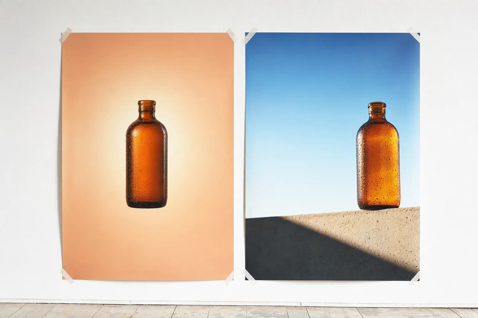
Everyone blames the model. You typed a careful prompt, the generator gave you a centred bottle floating on a peach gradient with a soft glow behind it, and it looked exactly like the last four things you made. So you tried a longer prompt and got the same ad in a different colour.
AI ads look like AI for one reason, and it is not model quality. A prompt is a handful of words, so the model fills every gap you left with the average of everything it has seen. Average lighting, average composition, average colour. The fix is not a better prompt, it is giving the model a real piece of human work to follow, so the gaps get filled with someone's actual decisions instead of a statistical middle.
The look is an averaging artefact
Unspecified detail defaults to the middle of the training data. That middle is the AI aesthetic.
Prompts underspecify by design
Thirty words cannot encode a layout, a light source, a crop and a type hierarchy. A picture can.
Readers penalise the look, not the method
Research points the same way: AI creative does fine until people can see it was AI.
Labels are now automatic
Meta and Google attach AI disclosures themselves. Hiding it is no longer a strategy.
A reference beats a longer prompt
Hand the model work a human already got right and the taste comes with it.
01
The tells that make an AI ad look like AI
When someone says an ad looks AI, they are usually reacting to five or six specific things at once. It helps to name them, because each one has a different cause and a different fix.
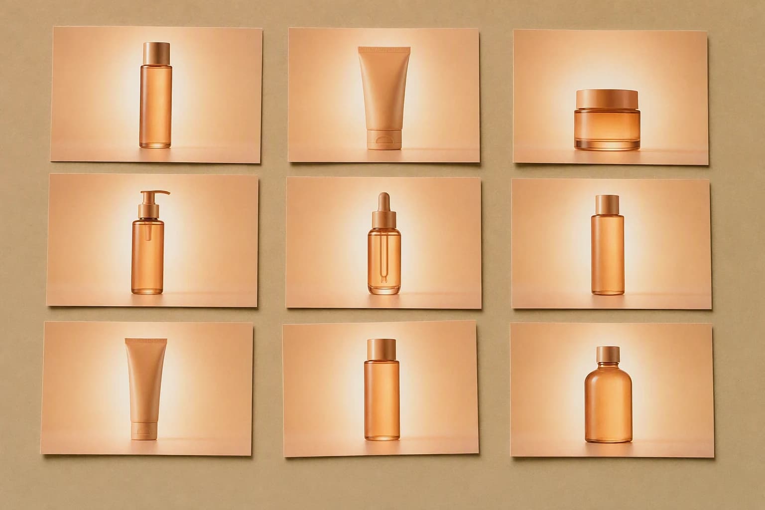
Dead-centre product
No crop, no angle, no reason for the framing. Nobody art directs this way.
The gradient nobody chose
A soft warm wash with a glow behind the product, on every ad, in every category.
Unmotivated light
Shadows that imply two or three light sources, none of them in the frame.
Over-smoothed surfaces
Skin, fabric and packaging lose their fine texture and read as plastic.
Turned-up saturation
Colour pushed past where any brand would take it. This one is measurable.
Nothing to look at second
No hierarchy, no joke, no hook. A picture of a product, not an ad.
"I ran 60 variants for a candle launch and my designer picked them out of a lineup in about four seconds. She said they all had the same glow behind the jar.", Dan, home fragrance brand
02
Why the model defaults to that look
A prompt is not a specification. It is a few dozen words describing an image that needs millions of decisions, so the model resolves everything you did not mention toward what it saw most often. And what it saw most often is commercial stock and retouched studio photography, where the lighting is soft, the surfaces are clean and the product sits in the middle.
Unsaid means averaged
Every gap in the prompt is filled with the centre of the distribution. Averages have no taste.
The training set was already retouched
Models learned from imagery where texture had been smoothed away, so they treat smooth as good.
Everyone drew from the same well
Overlapping training data across the major models is why outputs from rival tools look like siblings.
03
What it costs when an ad reads as AI
This is the part that turns an aesthetic complaint into a media-buying one. The research that exists points in a consistent direction: AI-made ads can beat human-made ads on click-through, but only while viewers cannot tell they were AI-made. The moment the tells are visible, the advantage goes. The Harvard and Oxford working paper "AI in Disguise" found exactly that, and singled out heavy colour saturation as one of the cues doing the damage.
7%
Consumers who trust a brand more for visible AI content (Klaviyo, 2026)
31%
Who trust it less
39%
Who say heavy AI use reduces trust, up from 20% in 2025
37 pts
Gap between how positive execs think buyers feel and how they do (IAB)
04
How to stop your AI ads looking like AI
- 1
Start from a real ad, not a blank prompt
Pick one piece of creative that already works in your category. That is your specification.
- 2
Name the light and the lens
One source, one direction, one focal length. Unmotivated lighting is the tell you can kill in a sentence.
- 3
Feed the model your actual product
A product photo as a reference keeps the packaging, the proportions and the logo honest. A description will not.
- 4
Pull the saturation and the smoothness back
Grade every variant toward your real brand colours and leave texture in. Both are measured tells.
- 5
Break the symmetry deliberately
Off-centre crop, something entering frame, a hand in shot. Give the eye a second thing to do.
- 6
Check it against the reference, not the prompt
The question is never "did it follow my words". It is "does this hold up next to the ad I started from".
"Naming the light was the one that fixed it for me. One window, from the left, nothing else. That single line did more than the paragraph of adjectives I had before it.", Iwan, outdoor gear brand
05
What a reference carries that a prompt cannot
This is the whole argument, and it is worth being precise about it. A prompt encodes intent as adjectives. A reference encodes decisions as pixels. When a designer made that ad they chose a crop, a hierarchy, a moment of wit, a place for the eye to land. None of that survives being compressed into the word "premium".
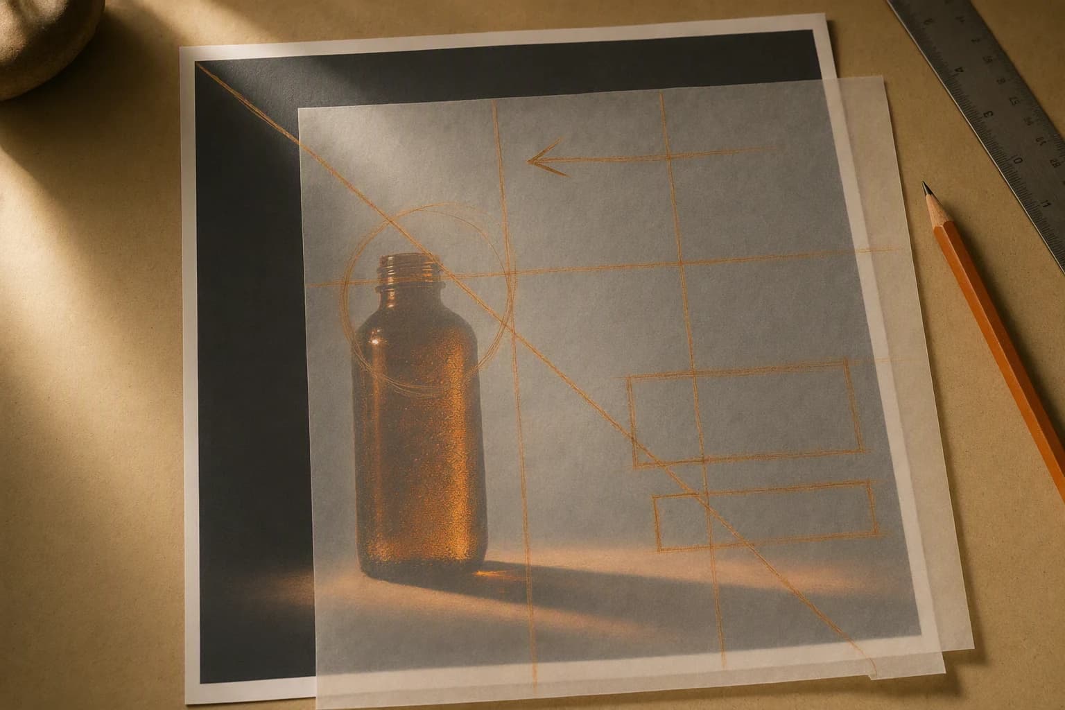
Two ways of asking for the same ad
Prompt only
Reference led
The first month I was writing prompts and getting the same shiny bottle back. Now I start from an ad I like, and my last three winners came out of that. Same model, I just stopped asking it to guess.
06
Where AIMS fits
You now know what to feed the model. The awkward part is doing it: finding work worth referencing, then getting the model to actually read it rather than glance at it. That is the job AIMS does. It holds a searchable library of real ads, emails, videos and social posts from other brands, analyses the one you pick to work out what the designer actually did, and hands that analysis to the model along with your product, your palette and your claims. The output carries the structure and the wit, with your product in it correctly. Our AI static ads generator and AI product video ads pages walk through it.
- Ads from Meta and TikTok, kept as references rather than screenshots
- Competitor email newsletters, including the long campaign builds nobody can prompt from scratch
- Video and UGC, where the reference carries pacing and shot order
- Pinterest, Etsy and Amazon listings, for product photography and packaging cues
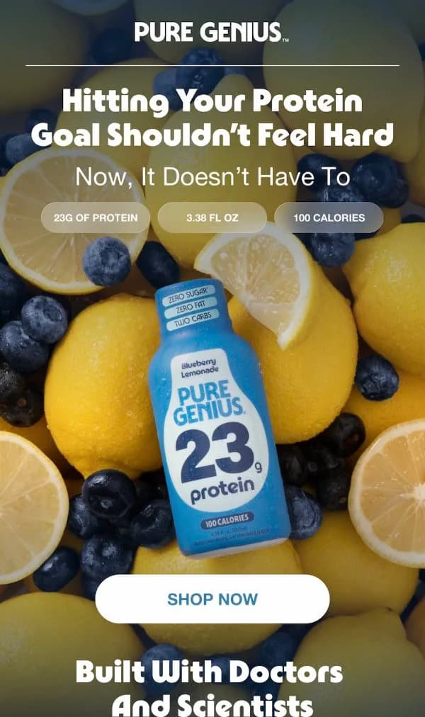
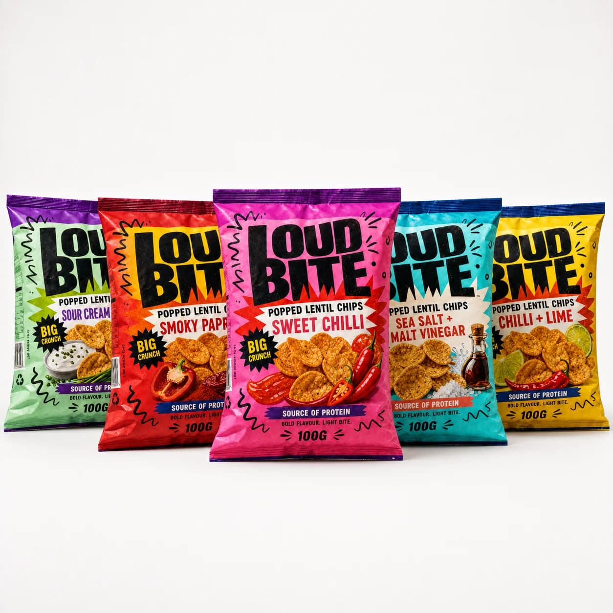
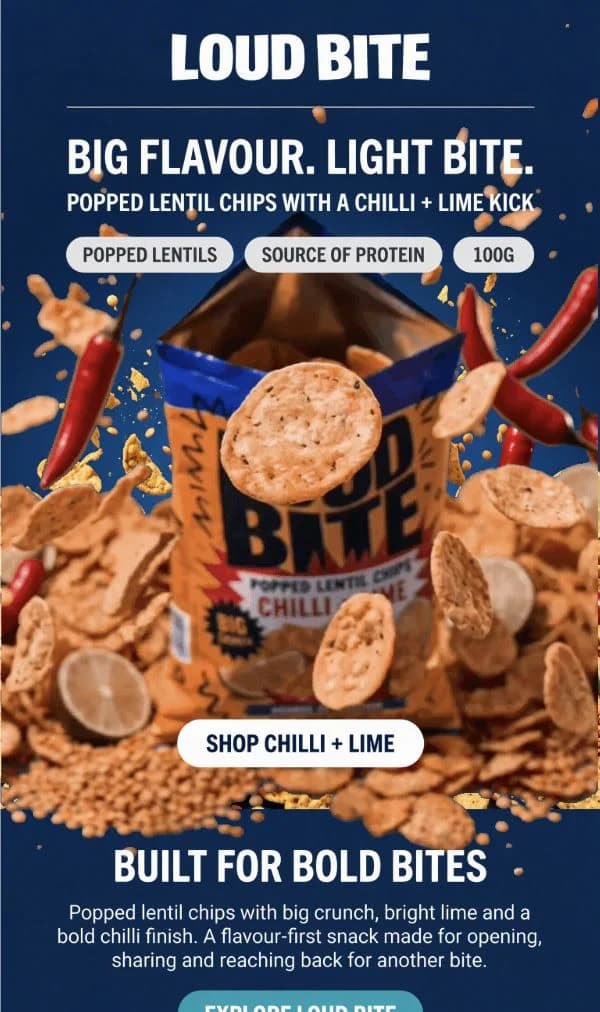
The point of the picture is not that the two look alike. It is that a person decided the badges should sit under the subhead and the product should be the only thing in focus, and that decision survived the trip to a completely different brand. No prompt I could write would have specified it, because I would not have thought to.
07
FAQs
Why do all AI images look the same?
Because they are all resolving toward the average of heavily overlapping training data. The major image models learned from similar pools of retouched commercial photography, so when a prompt leaves lighting, crop and colour unspecified, they each land in roughly the same place.
Why does AI-generated skin look plastic?
The training imagery was mostly already retouched, so the model learned that smooth equals high quality and strips the fine texture that makes skin read as real. Adding a reference photograph with real texture, and resisting the urge to upscale twice, is the practical fix.
Do AI ads perform worse than human-made ads?
Not automatically. The Harvard and Oxford "AI in Disguise" paper found AI-generated ads can beat human-made ones on click-through, but the advantage depends on viewers not being able to see that they were AI-generated. Visible tells, particularly heavy saturation, are what costs you.
Do I have to disclose that an ad was made with AI?
Increasingly it is not your call. Meta labels ads made with its own generative tools automatically and reads C2PA metadata from third-party tools. Google Ads introduced an AI disclosure requirement on 9 July 2026 with self-attestation for outside tools, and the EU AI Act's content marking obligation applies from 2 December 2026.
Will a longer prompt fix it?
It helps a little and then stops. Every extra clause specifies one more variable out of thousands, and the ones you never think to mention are exactly the ones a designer got right by instinct. A reference image specifies all of them at once.
Is using a competitor ad as a reference legal?
Taking structure, format and creative approach is normal practice and the platforms publish these ads deliberately. Taking their logo, photography, footage or copy is not. Keep the line at decisions, never assets.