
How to Recreate a Competitor's Ad for Your Brand (Legally)
Their layout is a method. Their photograph is property. Almost everybody gets that the wrong way round.

Henry SedgwickProduct marketing
You can recreate a competitor ad for your brand, and the line is simpler than the internet makes it sound. Copyright covers what they made, not what they worked out. Their photograph, their sentences and their logo belong to them. The order of the elements, the type of hook, the decision to hang a benefit off a line pointing at the jar: none of that belongs to anybody.
Most people get this backwards. They lift a headline word for word because it is only text, then worry about whether they are allowed to put their own product in the middle of the frame with two callouts around it. The first is the real risk. The second is a layout, and a layout is a method.
1903
The year the US Supreme Court settled that adverts get full copyright protection
6
Structural decisions in the real ad further down, every one of them free to reuse
0
Of their pixels, sentences or logos that should end up in yours
01
Is it legal to recreate a competitor ad?
Yes, if you take the thinking and leave the artefact. Advertising has been squarely inside copyright since Bleistein v. Donaldson Lithographing in 1903, when the Supreme Court held that a picture does not lose protection for being made to sell something. So their creative is protected work. What is protected is the specific expression of it, not the reasoning behind it.
The line, element by element
Free to take
Leave it alone
02
A teardown of one real ad
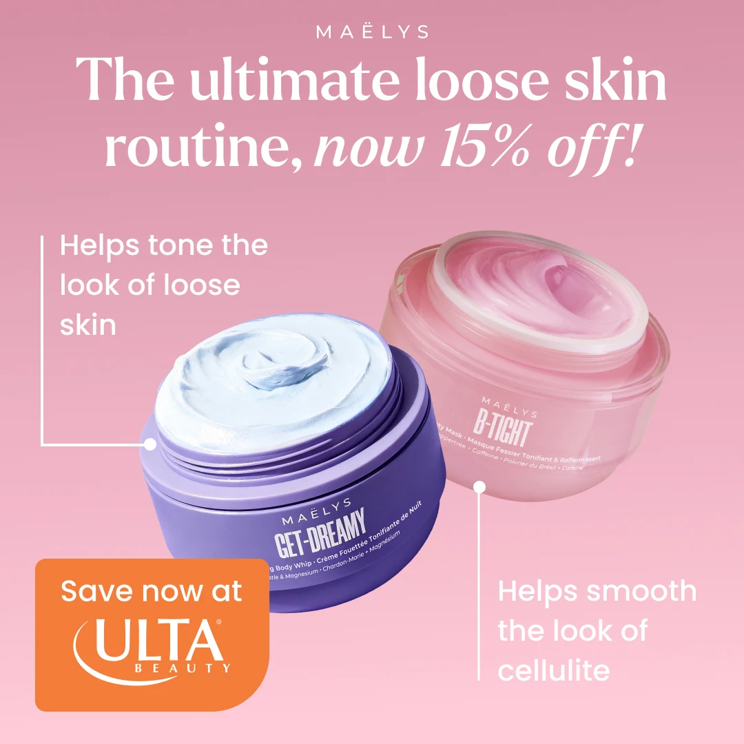
Here is a MAËLYS Cosmetics ad, pulled out of the AIMS library, running on Meta this summer. I have marked the six decisions in it. Every one is a choice somebody made on purpose, and none of them are owned by anybody.
Six decisions, none of them protected
Which ads are worth the effort
- It has been live for weeks. Longevity is the only free performance signal you get.
- It carries one idea. If you need three sentences to describe it, it will not survive translation.
- The product is visible and large. Ads built around a mood do not transfer to a different brand.
- The structure is doing work a headline could not do on its own.
- It comes from a brand roughly your size, so the production values are reachable.
“I had a folder of 200 screenshots and I never opened it once. What changed was writing six lines under each one. Now the folder is a brief file, not a graveyard.” Dan, outdoor kit, doing about 60k a month
03
What a lazy clone looks like
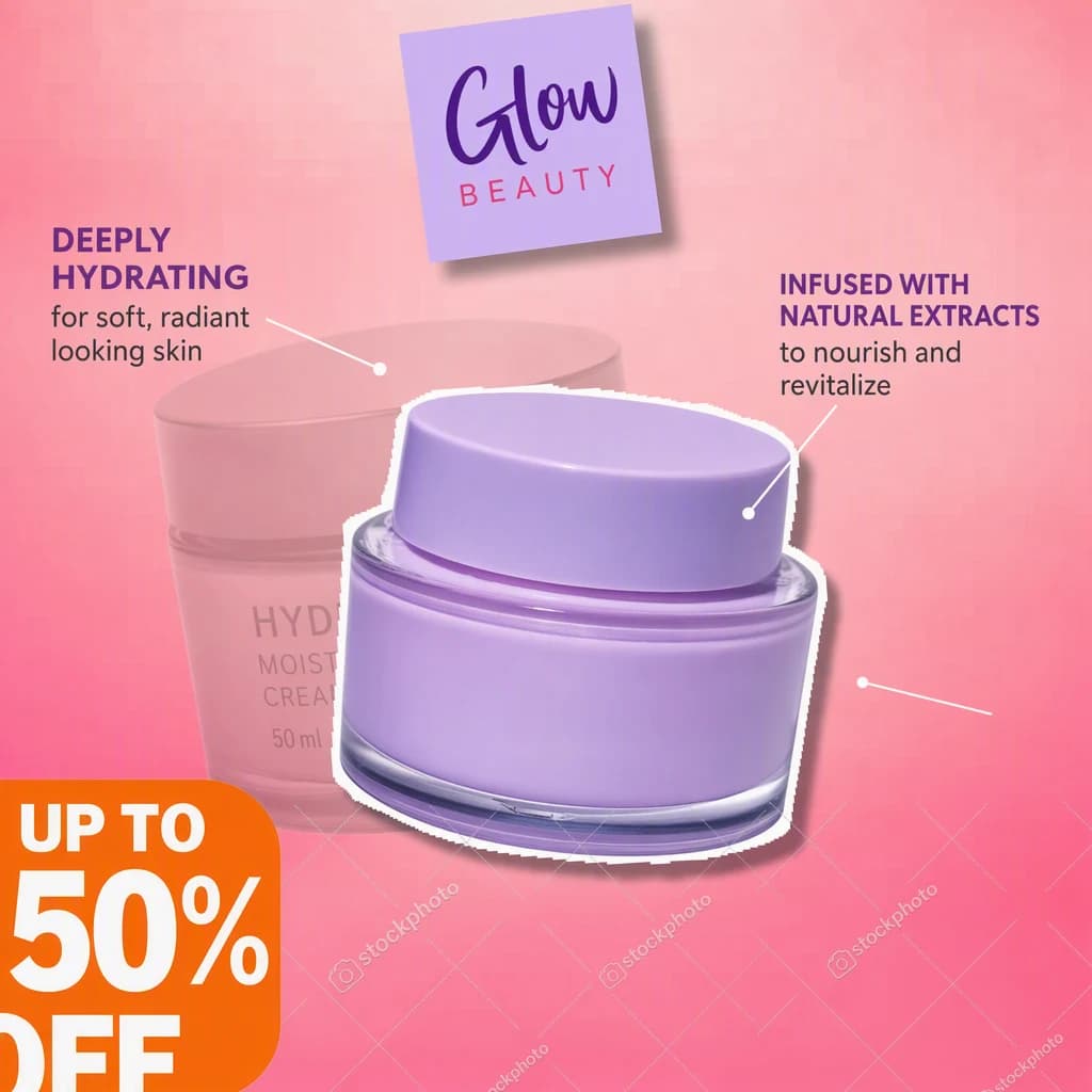
The failure mode is not caution, it is speed. Somebody screenshots the ad, cuts out their own product, drops it over the top and ships it. Below is roughly what that produces. I generated this one, because nobody wants their real work used as the bad example.
It is the one version that is actually infringing
You have reused their photograph and their composition as a whole. That is the thing copyright does protect, and it is the easy case to make against you.
Platforms have a report button for it
Meta runs an intellectual property complaint process. A rights holder does not need to sue you, they need to fill in a form, and your ad account is the thing at risk.
It sells their brand, not yours
If the palette, the type and the mood are all theirs, the person who sees it remembers the brand it was designed for. You have paid to advertise a competitor.
The reason it worked does not travel
Their ad fits their product, their price and their audience. Copy the surface and you inherit none of that fit.
The honest version is not slower
Rebuilding from a written brief takes the same afternoon, and the result is yours.
04
How to recreate a competitor ad, step by step
- 1
Pick an ad that has been running a while
An ad still live after two months is being fed budget for a reason. A brand new one tells you nothing.
- 2
Write the six lines
Order, hook type, product treatment, offer placement, what got left out, call to action. If you cannot reach six, the ad is thinner than it looked.
- 3
Get your own product shot sorted first
People skip this and it decides everything. The product photography is the input that makes the finished ad look real or fake.
- 4
Rebuild the skeleton, replace every asset
Same order, same hierarchy, same rhythm. Your palette, your type, your words, your product. Nothing of theirs crosses over.
- 5
Change one thing on purpose
Their audience is not yours, so usually the hook or the offer has to move. Identical in every respect except the logo is the lazy clone with better manners.
- 6
Test it against your own control
You have no idea what their ad did. You do know what yours does. Run the recreation against your current best performer.
05
The same skeleton, a different brand
Here is that MAËLYS ad used properly. On the left, the original. On the right, what AIMS built for Loud Bite, who sell popped lentil chips, from the same reference and a photograph of their own range. Body cream to snacks, which is about as far as a category can travel.
Reference on the left, rebuild on the right
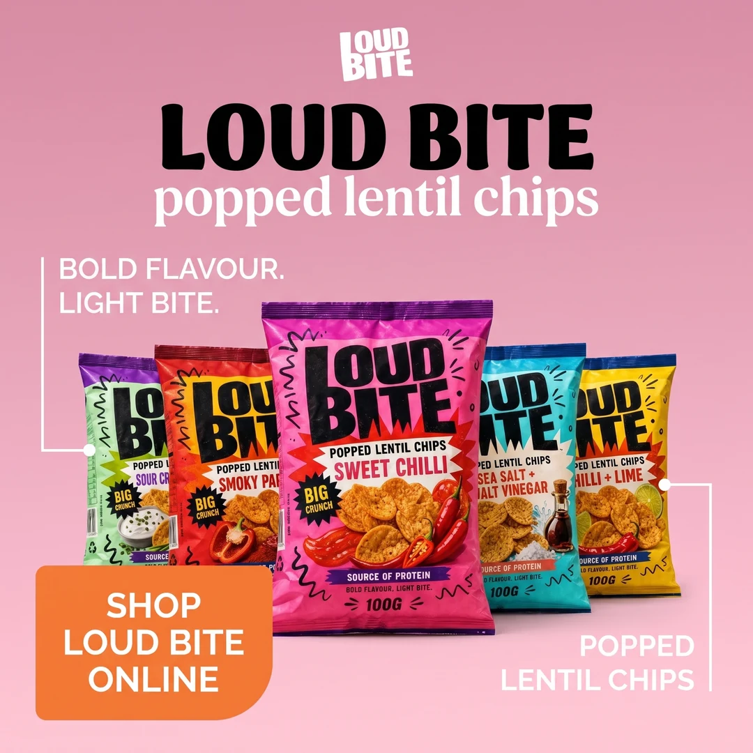
The layout is the part somebody thought hard about. It is also the part nobody owns. That is a strange and very useful fact.
06
Why this is the bit AI is good at
Image models have got extremely good at making things, and can hold a product almost perfectly now. What they have never had is judgement. Ask one for "a static ad for my body wash" and you get the average of every ad it has seen, a centred bottle on a gradient, because it has no opinion about where the benefit should sit.
A finished ad from a real designer contains all of those decisions already. That is the whole trick. You are not asking the model to have taste, you are handing it the record of somebody else having had it, then letting it do the part it is genuinely better at, which is producing the thing twenty times without getting bored.
What a model is good at
Rendering. It will hold your bottle steady across fifty frames without the label drifting, at a speed no person can match.
What it is bad at
Deciding. Given a written description it returns the average of everything it has seen, because an average is the safest answer to a vague question.
What a reference does
It removes the deciding. A finished ad is the record of a person having made every call already, so the judgement arrives with the file.
07
Where AIMS fits
This is what AIMS is for. The library is a free searchable archive of real ads, emails, videos and pins from Meta, Instagram, TikTok, Pinterest, Amazon and Etsy, which is where the MAËLYS ad came from, and the free Chrome extension saves anything you find while browsing straight into it. Pick something worth learning from and AIMS does the teardown step itself, then hands that analysis to the model with your product photography and your palette. The teardown page walks through the loop. What comes back is your ad with their structure and none of their assets.
08
FAQs
Is it illegal to copy a competitor ad?
Reproducing their actual creative, the photograph, the copy, the logo, is infringement, and adverts have been protected work since 1903. Using the same layout, hook type or structure is not, because copyright explicitly does not cover procedures, methods or concepts.
Can I use a competitor brand name in my ad?
Usually yes, if you are genuinely referring to them, use no more of their mark than you need and do not imply they endorse you. That is nominative fair use, and the FTC has stated that truthful comparative advertising helps consumers. What you cannot do is make a claim you cannot substantiate.
How similar is too similar?
The practical test is whether somebody scrolling would think your ad came from them. If the palette, the type, the photography style and the packaging cues all point at their brand, you are into trade dress territory, which is a different law and cares about consumer confusion rather than copying.
How do I find competitor ads worth recreating?
The Meta Ad Library is free and shows everything currently running, including how long it has been live, which is the closest thing to a performance signal you get without paying. Libraries built for this add Pinterest, TikTok, Amazon and Etsy alongside it, which matters because a pin is often a better static ad reference than another Meta ad.
Does an AI generated recreation need to be labelled?
Increasingly yes on the platform side. Meta has been labelling ads created or significantly edited with generative AI since early 2025, and Google added an AI label setting for image and video ad creative in July 2026 to help advertisers meet regional rules. Check the requirements where you run, they are moving quickly.