
Klaviyo Email Templates That Convert (With Real Examples)
The layout is not the variable. The order of the blocks is.

Henry SedgwickProduct marketing
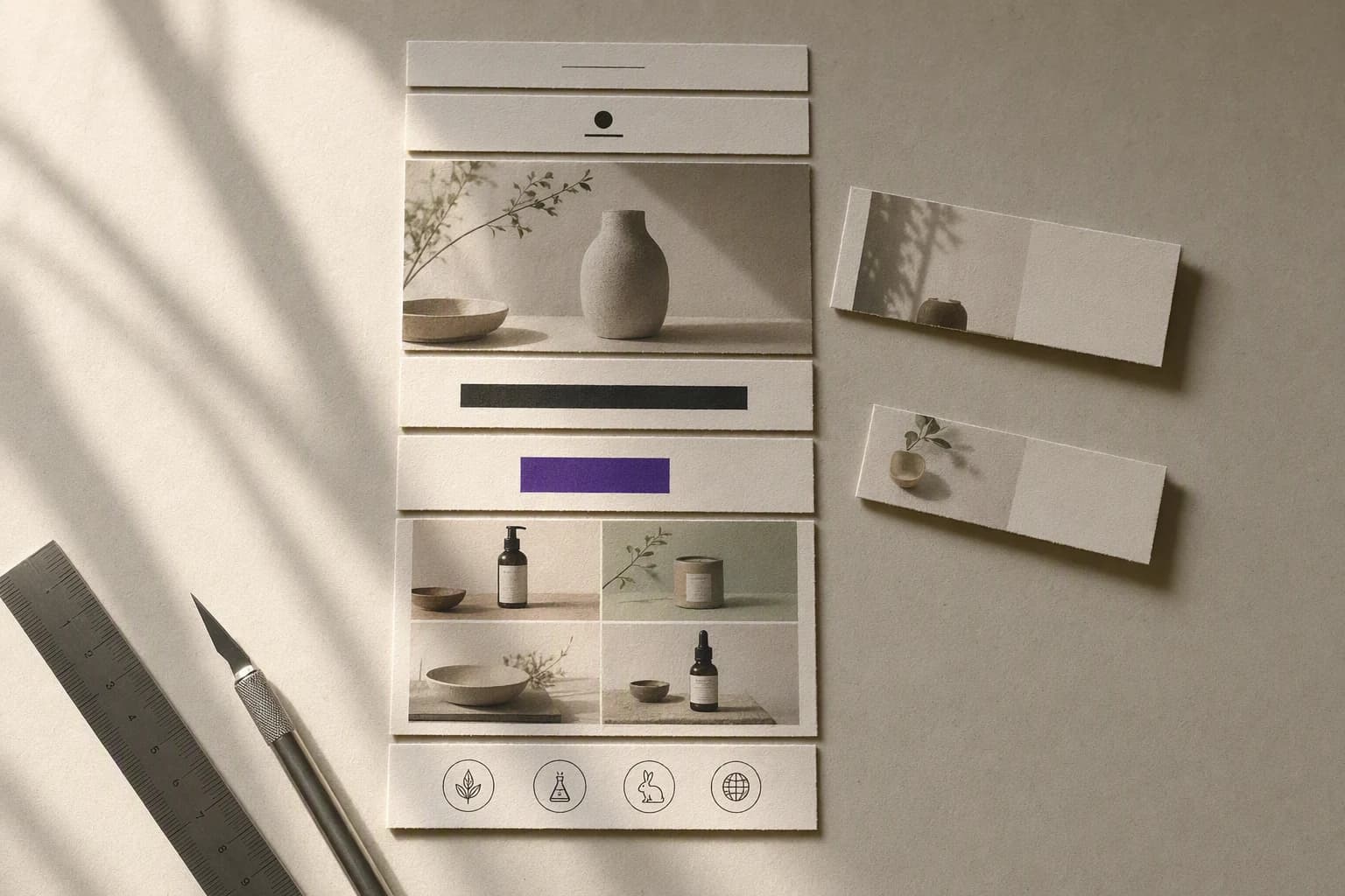
If you are searching for Klaviyo email templates that convert, the useful answer is not a download link. Klaviyo ships a large library and the templates in it are fine. The reason your emails underperform is almost never the layout. It is that the same layout is being used for four jobs that need four different block orders.
A template in Klaviyo is a saved arrangement of blocks. Conversion is decided by which block comes first, and that answer changes depending on whether the person opening the email just joined your list, left a cart, bought something last week, or has ignored you for four months. Below are four real brand emails, pulled from the AIMS library, with the block order named for each.
160+
Templates in Klaviyo’s own library, by its count
600px
Default template width, which Klaviyo recommends you keep
3
Ways the library lets you filter: type, layout and season
01
What a Klaviyo template actually is
Worth being precise about this, because the word template does a lot of hiding. In Klaviyo you are not buying a design. You are saving a stack of blocks with your fonts and colours applied, and Klaviyo is clear that every one of those stacks is responsive by default.
A saved stack of blocks
Text, image, button, divider, product. Live blocks, not a flat picture. That is why the button works and the headline survives images being switched off.
600 pixels wide
Klaviyo sets every template to 600px and advises leaving it there unless you have a designer to test the wider version across clients.
A base template underneath
Klaviyo recommends building one base template holding your header, body placeholders and footer, then using it as the basis for every campaign and flow email.
Universal content on top
Save a block once and update it everywhere it is used. Your footer, your trust row, your nav. Build these once and stop rebuilding them.
02
Klaviyo email templates that convert are decided by block order
Here is the whole argument in one picture. Take the same six blocks. Stack them one way and you have a welcome email. Stack them another way and you have a winback. Same components, same brand, same 600 pixels. Completely different email, because the reader is in a different place.
The same six blocks, two flows, two orders
You do not need better templates. You need the same blocks in the right order for the moment the reader is actually in.
03
Four flows, four block orders, four real emails
Every email below is a screenshot of something a brand really sent, pulled from the AIMS library. I have credited each one. Read them for structure rather than styling, because the styling belongs to them and the structure works for anyone.
Welcome: put the offer above the hero
Two welcome emails, two placements of the same offer
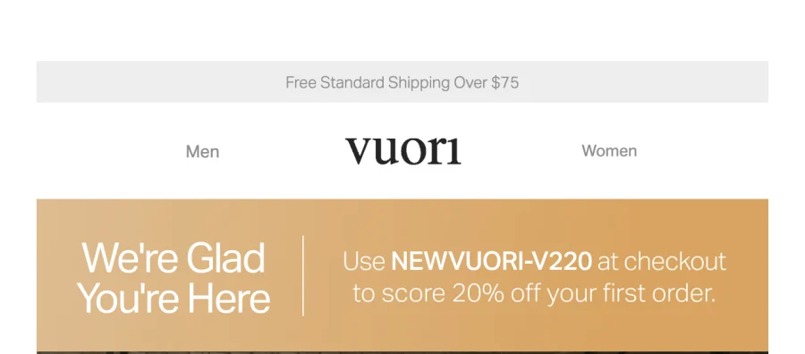
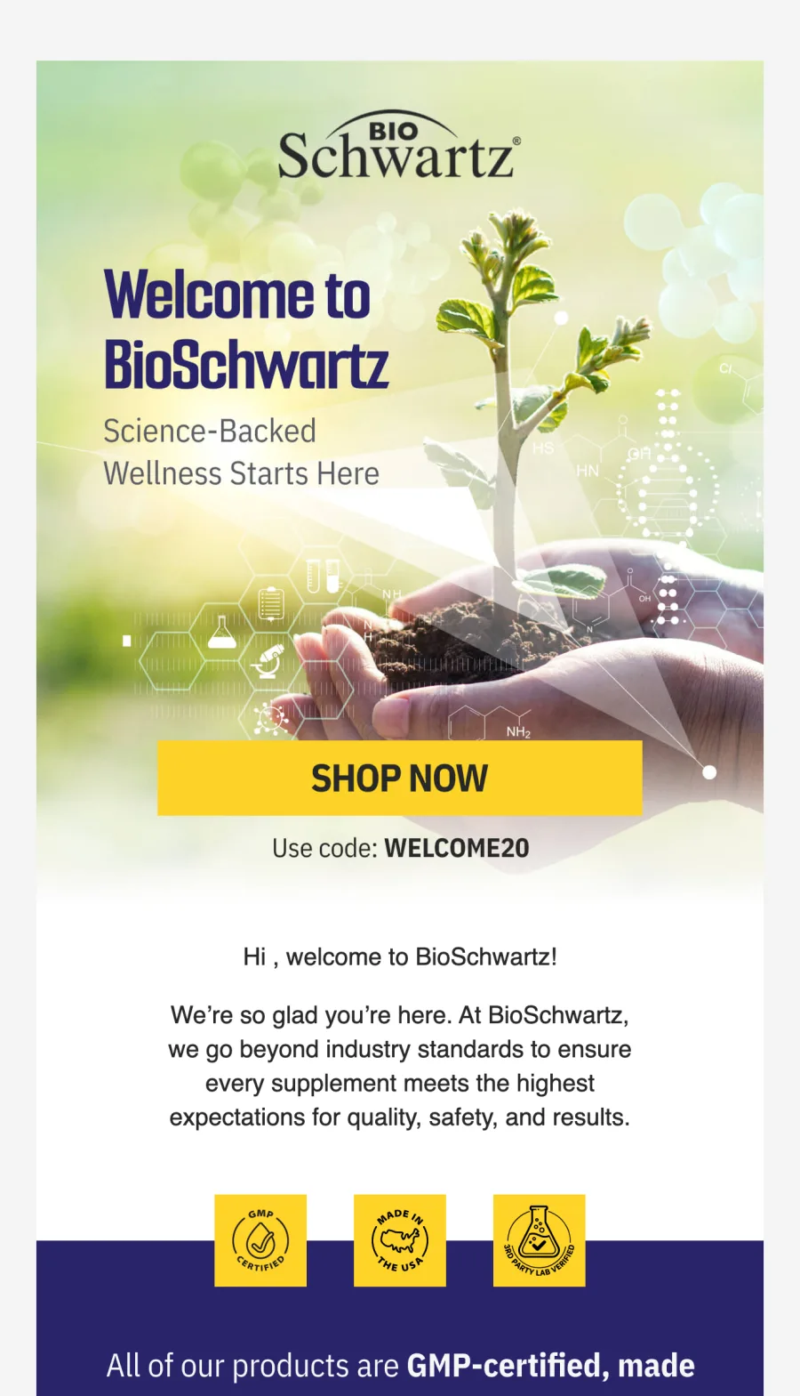
- The offer appears in live text, not only inside an image, so it survives images being blocked.
- The brand promise is one line, not a founder essay. Vuori gives it four words.
- Trust sits directly under the first button. BioSchwartz uses GMP certified, made in the USA and third party lab verified.
- The product grid comes last, because browsing is what happens after the offer has landed.
Abandoned cart: this flow needs two templates, not one
The mistake here is saving one cart template and sending it twice. The two messages are doing different jobs, so their block orders differ in one specific place. The first is a reminder. The second is the one allowed to spend money.
Which blocks belong in which cart email
First email
Second email
Post-purchase: annotate the product they already own
OUAI, keeping a routine stocked
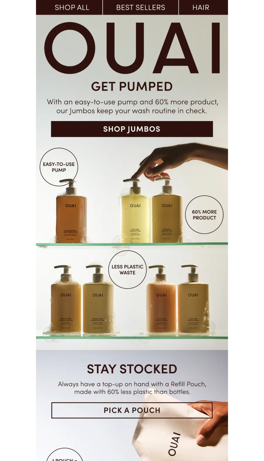
What makes this work as a repeat-purchase email is that it does not argue for the product. The customer already bought it. It argues for a bigger size and a refill pouch, and it uses circular callouts on the photography to carry the reasons instead of a paragraph. That annotation trick is worth stealing outright, because it puts the selling text where the eye already is.
Winback: stop selling and ask a question
Two winbacks that handle the offer completely differently
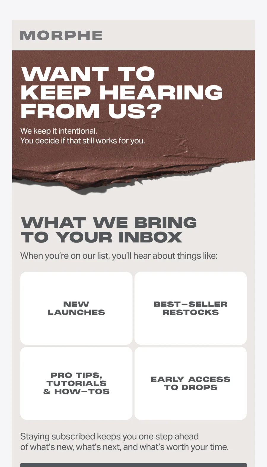
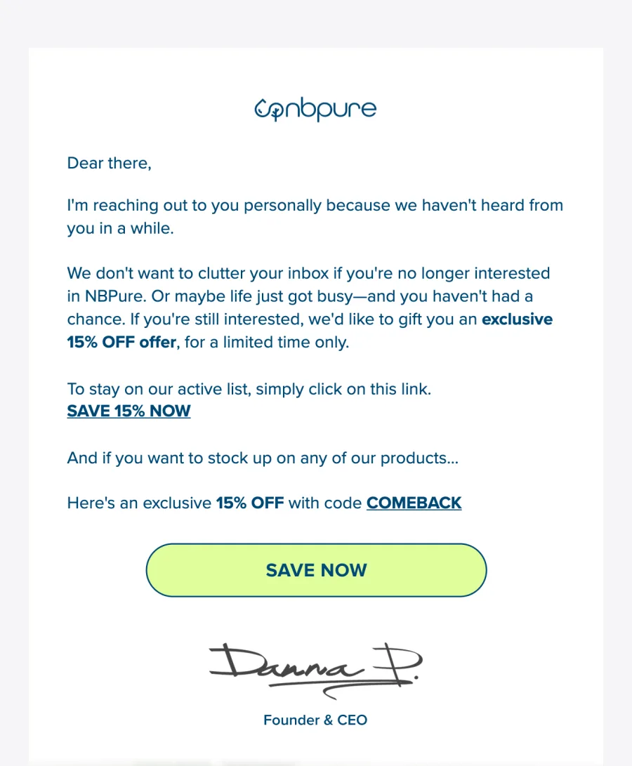
"Our winback was a 25 percent code for a year and it did nothing. We swapped it for a plain email asking if they still wanted us, with the code right at the bottom. More people clicked the stay subscribed link than had opened the last six sends." Dervla, candles and home fragrance, five staff
04
Five things that hold across every flow
Every headline is live text
Turn images off in Gmail and the email should still make its point. BioSchwartz puts its welcome line inside the hero image, which is the one thing I would change about it.
One primary button above the fold
Secondary links can come later. Four equal buttons in a row is four chances to choose nothing.
The offer moves, it does not disappear
Near the top in a welcome, in the second cart email, near the bottom of a winback. Same block, different position, and the position is the decision.
Trust sits under the first ask
Guarantee, returns, certifications, review count. Directly beneath the button, where the hesitation happens.
Test it with the merge tags empty
Two of the four emails here shipped with a missing or awkward first name. It is the cheapest bug in email and almost nobody checks for it.
05
How to build these without a designer
This is the part I have opinions about, because it is why I built AIMS. If you ask an image model for an email you get a picture of one, a flat JPEG with no live text and no working button. If you ask a builder to write one from a prompt you get real blocks in an order nobody has ever tested.
The models are genuinely good at making things now. What they do not have is taste, and taste in an email is almost entirely sequence. The order in the OUAI email exists because a person decided the callout circles should carry the argument. So do not describe what you want to a model. Hand it an email that already worked and let it carry the structure across to your brand.
- 1
Find the email whose job matches yours
AIMS Discover is a free searchable archive of real brand emails, filtered by type. Welcome, Restock, Survey, Newsletter, Abandoned Cart and others. Filter to the flow you are building rather than to a colour palette you like.
- 2
Let the teardown read it for you
The analysis step writes down what the designer actually did: the block order, where the offer sits, which objection the trust row answers. That written analysis is what the model receives, not just a screenshot.
- 3
Rebuild it on your product
Your photography, your palette, your voice, on a skeleton that has already been sent to a real list. Live blocks, so the button works and the headline survives blocked images.
- 4
Save it as a Klaviyo template and split the flow
One saved template per message, not per flow. Then change one block at a time and let the numbers tell you whether the order was right.
"I had one master template doing welcome, cart and winback. Splitting it into three, with the discount block in a different place in each, took an afternoon. It is the only email change I have made that I could actually see." Tomas, coffee subscription, about 30k a month
06
Common questions
Are Klaviyo’s built-in templates good enough?
For structure and deliverability, yes. They are responsive, they are 600px, they use real blocks. What they cannot do is know which flow you are building, so they hand you a neutral arrangement and leave the ordering decision to you. That decision is the one that moves the number.
How many templates do I actually need?
One base template with your header and footer, then one saved template per message rather than per flow. A two-email cart flow is two templates. Most brands under-count here and end up sending the same email twice with a code bolted on.
Should I buy a paid Klaviyo template pack?
They are fine, and some of the Figma packs are genuinely well made. Just be clear about what you are buying. A pack gives you a look, and a look is the part you were closest to solving on your own. It will not tell you where the offer block goes in a winback.
Where can I see real ecommerce emails to copy structure from?
AIMS Discover is free and filterable by email type, which is where all four screenshots in this article came from. Really Good Emails is another solid gallery. A filterable archive beats a listicle because you can find brands in your own category instead of the same famous five.