
Can AI Design an Email Newsletter? Yes, With One Catch
The model will hand you a layout. What it will not hand you is the reason the layout works.

Henry SedgwickProduct marketing
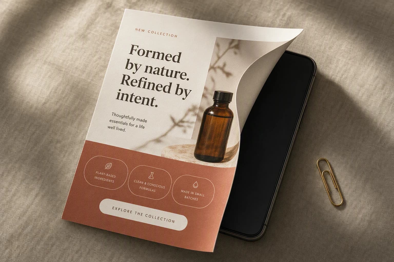
Yes, AI can design an email newsletter, and it is genuinely good at parts of it. The catch is that most people ask for the wrong thing and get a picture of an email rather than an email. Those are different objects, and only one of them can be sent.
An email is not a single image. It is a stack of separate blocks, live text, several photographs, a hierarchy that decides what you read first, and buttons that have to be clickable. Ask an image model for "an email newsletter design" and it will draw all of that beautifully onto one flat rectangle. Paste that into Klaviyo and you have posted a poster.
102KB
Where Gmail starts clipping a message on desktop, and lower again on mobile
4
Things Klaviyo’s own email AI will not fill in for you
6
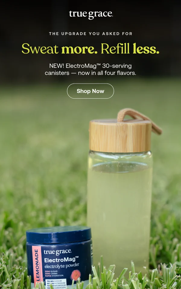
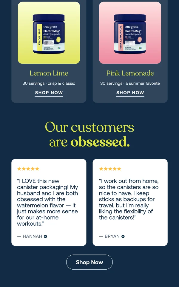
Separate calls to action in the real brand email further down this page
It depends which of three tools you point at the problem, and they fail in different places. Here is the honest split.
Three routes, three different halves of the job
Image model
Builder’s built-in AI
A real email as the reference
02
What an email actually is
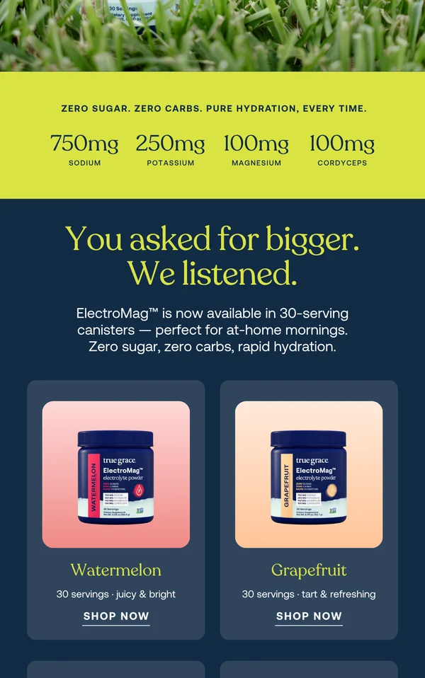
This is a real campaign email from True Grace, pulled out of the AIMS library. I have split it into three columns so the whole thing fits on one screen. Look at how many separate decisions are in it.
One email, read left to right
03
Why a picture of an email is not an email
The text is not text
Copy baked into an image cannot be read by a screen reader or resized, and you cannot edit a word of it without regenerating the file.
Most Outlook builds block images
Image blocking is on by default in a lot of clients. If your entire email is one image, a large share of your list opens a grey rectangle.
The button is not a button
A drawn call to action takes no clicks, so the campaign produces nothing you can measure afterwards.
Weight gets you clipped
Gmail hides everything past roughly 102KB of code on desktop behind a "view entire message" link, and the threshold is lower on mobile.
Clipping takes your open rate with it
The tracking pixel usually sits at the bottom. When the message is clipped the pixel goes too, so opens stop being recorded properly.
Dark mode does what it likes
Live text and real blocks can be told how to behave when a client inverts the palette. A flat image just sits there in the wrong colours.
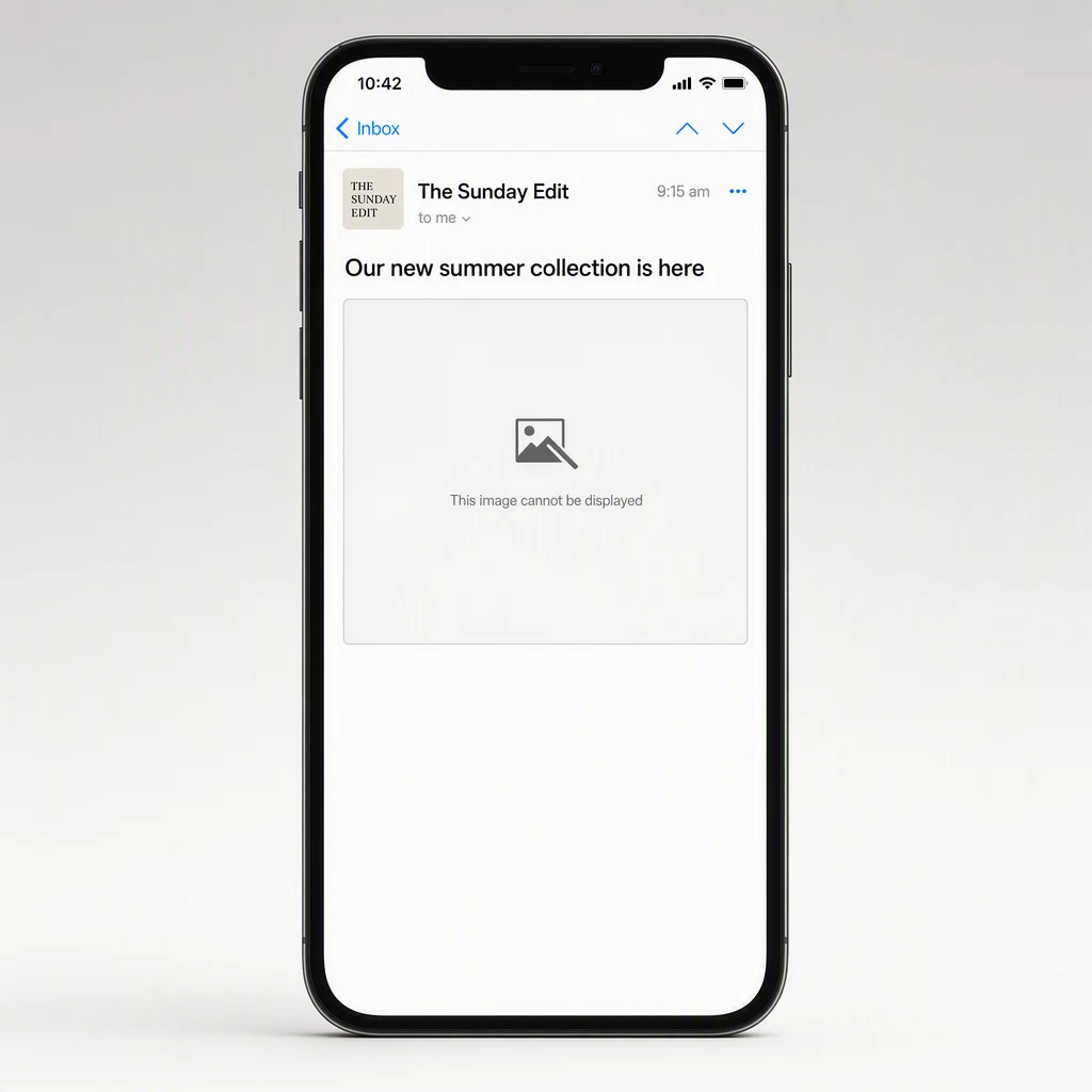
“I spent a fortnight generating gorgeous email designs and could not send a single one. Nobody had told me the output was a JPEG.” Marcus, mens grooming, team of three
04
What the email builders’ AI actually does
The AI inside the email platforms is the sensible route, because it outputs real blocks instead of a flat image. Klaviyo will generate a section or a whole draft from a description, and its newer tooling produces a native drag and drop template rather than raw HTML you have to rebuild by hand. Worth using.
It is also worth reading their documentation closely, because it is unusually honest about the boundary. Klaviyo says its email AI will not supply the images, the alt text for those images, the URLs behind your buttons and links, or the contents of a product block. You get the arrangement. Everything with a judgement in it is handed straight back to you.
What it generates
Text blocks, image blocks, two and three column layouts, buttons, dividers, spacers and product blocks, styled from your template settings.
What it leaves blank
The photographs, the alt text, the destination of every button, and whatever is meant to sit inside the product block.
What it will not touch
Some block types are simply unsupported, so anything structurally unusual still gets built by a person.
How much you get
Klaviyo caps email AI at 99 generated sections per user per day, three results per request, so about 33 goes in 24 hours.
05
The catch is taste, not code
Here is what I think is going on. AI has become extraordinary at making things. Image models render a product almost perfectly. What none of them have is judgement about whether the result is any good, and an email asks for that judgement six times over: what goes at the top, how far down the first ask sits, whether the proof lands before or after the price, which photograph earns the most height.
From a written brief the model has nothing to go on, so it produces the average of every email it has seen. Give it an email a designer already built well and that reverses. The decisions are sitting in the finished artefact, and they can be read off it and reused. That is the whole trick, and it is why the answer here is a qualified yes rather than a no.
The same skeleton, a different brand
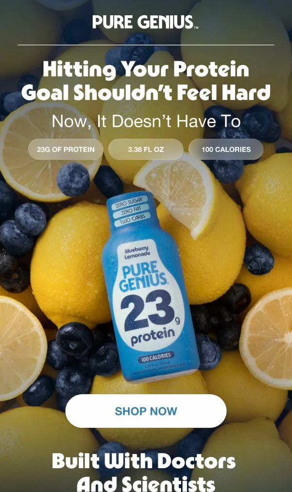
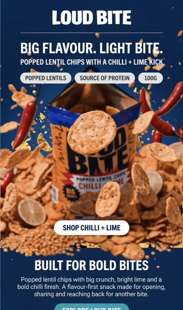
Arrangement is cheap now. The reason for the arrangement is the expensive part, and it is already sitting in somebody else’s finished email.
06
A workflow that gets an email sent
- 1
Find an email you would be pleased to have sent
From an archive, or a mailbox you signed up with. Pick for structure rather than prettiness, ideally from a brand roughly your size.
- 2
Write down what it is doing
Module order, how far down the first ask sits, where the proof lands, how much height the hero takes. Six lines is plenty.
- 3
Get your own photography in order first
Every route above hands the images back to you. A clean product set is the input that decides whether the finished email looks real.
- 4
Rebuild the structure, not the content
Same skeleton, your palette, your copy, your product. Nothing of theirs travels across, including the photography and the wording.
- 5
Fill in what the AI left blank
Alt text on every image, a real URL behind every button, the product block pointed at real products. This is fifteen minutes and it is not optional.
- 6
Send yourself a test and try to select the headline
Then open it with images off, and open it in dark mode. Three checks, two minutes, and they catch nearly everything that goes wrong.
07
Where AIMS fits
AIMS sits in exactly this gap. The library is a free searchable archive of real brand emails, which is where the True Grace one above came from. Pick an email worth learning from and AIMS pulls apart what the designer did, the module order, where the proof sits, how much height the hero takes, then hands that analysis to the model with your product photography and your palette. What comes back is your email with their structure, as real blocks you can export into Klaviyo. The emails page walks through the loop.
08
FAQs
Can AI design an email newsletter from scratch?
It can produce a layout from scratch, and inside a platform like Klaviyo that layout will be made of real editable blocks. What it cannot do from scratch is know which layout is right for your product and your offer, because that judgement was never in the prompt. It comes out generic unless you give it something specific to work from.
Why does my AI generated email look like one flat image?
Because you probably used an image model. Those produce a picture of an email, which is exactly what you asked for. To get something sendable you need a tool that outputs blocks, either the AI built into your email platform or a reference driven builder that exports into it.
Is an image only email really that bad?
Yes. Many mail clients block images by default, so a share of your list sees an empty box. Screen readers get nothing but the alt text. The button is not clickable. And you cannot edit a word of it without regenerating the file.
Will AI write the copy as well as design the layout?
The copy is the part it is best at, particularly subject lines and short body blocks. Give it your voice and a real product detail to hold on to. What it writes without either tends to read like every other email in the inbox.
What is the fastest way to get a good looking email out this week?
Find a real email with a structure you admire, write down its module order, and rebuild that order with your own product photography and copy. It is faster than describing a design you cannot quite picture, and the result has a tested shape rather than an invented one.