
Why AI Product Images Get Your Product Slightly Wrong
It is not a prompt problem. It is a description problem.

Henry SedgwickProduct marketing
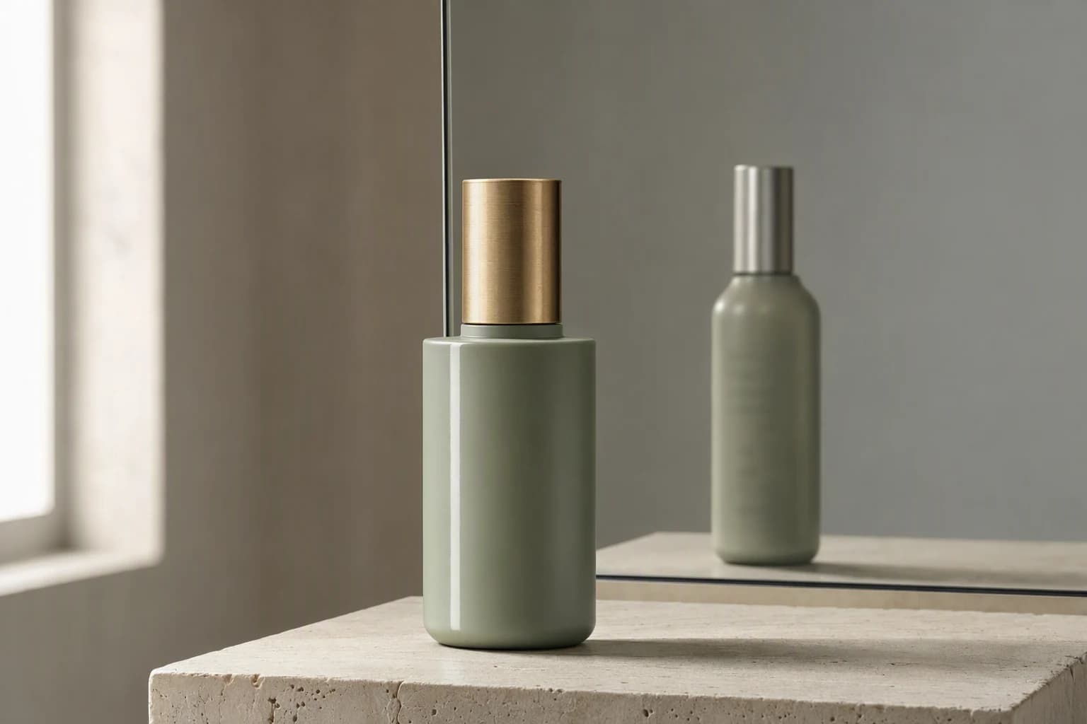
If your AI product images keep coming back with the wrong product in them, you are not prompting badly. The bottle is a little too tall. The cap is the wrong metal. The label looks like your typeface from across a room and nothing like it up close. The reason is worth being blunt about: unless you hand the model your actual photograph, it is not copying your product. It is drawing something that matches your description of it.
Those are different jobs. A description is a lossy summary, and everything you forgot to mention gets invented, confidently and attractively. Words control the scene, but only pixels control the product, and if a detail matters (the wordmark, the closure, the stitching, the net weight line) it has to arrive as an image. So the fix has two halves: lock the product with a real reference image instead of adjectives, and take the scene from a photograph a person actually lit. I ran the test below to show what each half is worth.
01
I ran the test on a real product
Loud Bite make popped lentil chips. Their packs are a good test because they are busy: heavy black wordmark, scribbled doodles, starburst badge, flavour name, protein banner, weight mark. I wrote the most careful description of their real photograph I could manage (about 250 words) and generated from that alone. Then I generated again, same scene brief, with the photograph attached.
Same product, three ways
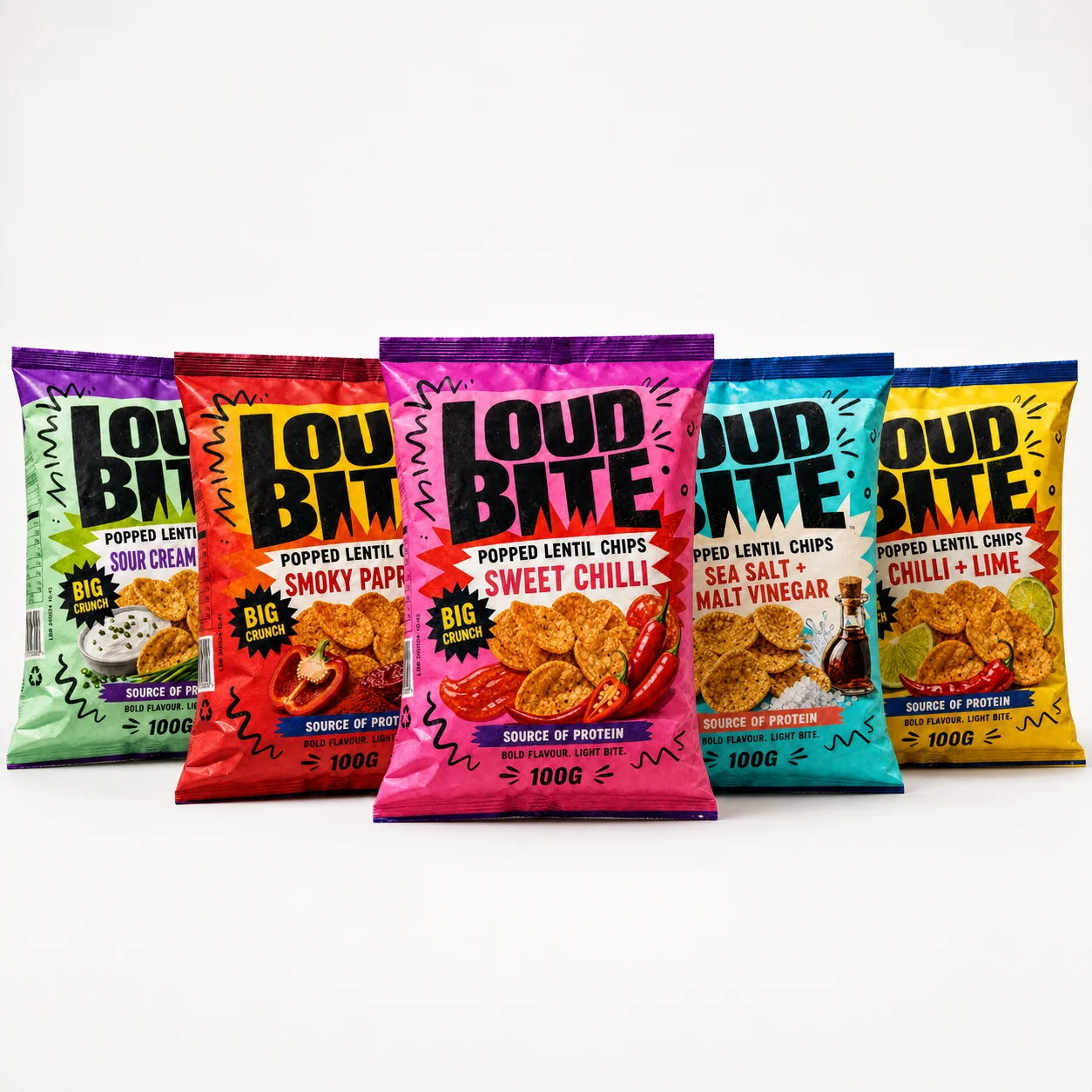
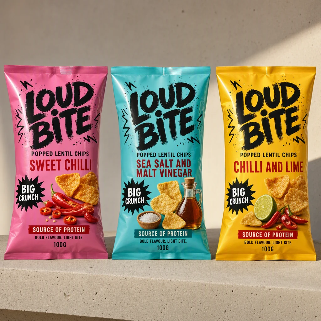
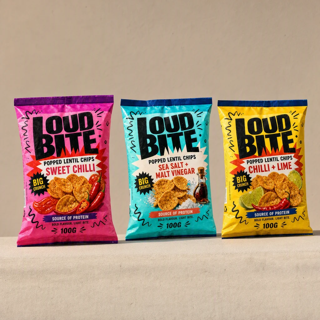
The middle image is the important one, and not because it is bad. It is good. I would happily put it in a grid. It is also, in twelve countable ways, not the product Loud Bite sell. That is the trap. A broken image gets deleted. A plausible one gets shipped.
Twelve things the description could not carry
"We shipped a month of paid social before someone in the warehouse pointed out the pump on our bottle was the wrong shape in every single ad. Nobody in marketing had noticed. They handle those bottles every day." Kofi, haircare, six people
02
Why AI product images drift in the first place
Knowing what happens tells you which fixes are real and which are superstition. When you generate from text, nothing about your product is in the system. The model reads your words, finds the region of everything it has seen that best matches them, and draws from there. Your brand is not in that region. Ten thousand other snack bags are.
Two different operations hiding behind one text box
Generate from text
Edit from an image
OpenAI ships a fidelity dial
Its image editing API has a high input fidelity setting, documented as being for "editing images with faces, logos, or any other details that require high fidelity". The existence of the setting is the admission. The docs also note only your first attached image keeps extra texture richness, so order matters.
Google labels its own tool experimental
Merchant Center Product Studio carries a live warning that it "may generate unexpected images and videos and works best with certain products", and it will not process images containing hands.
Reference slots are capped
Gemini's image models limit how many references you can attach, six object images on the Pro tier at the time of writing. Worth knowing before you plan a workflow around feeding it twenty angles.
29.0%
Best product fidelity pass rate of four leading edit models, Photoroom benchmark, July 2026
850
Real products tested, across clothing, footwear, bags, jewellery and accessories
3,400
Generations, each judged by three or more trained annotators, one flag and it fails
A broken image gets deleted. A beautiful, plausible, wrong one gets shipped, printed and paid for.
03
What people actually report going wrong
Almost every article on this subject says "users report" and then names nobody. Here are three threads I read in full, with dates. A product designer on r/productdesign summed the whole category up in one line in November 2025: every generator they tried distorted small fonts on packaging.
The SKU drifts across a batch
An operator writing up 100+ ecommerce generations on r/StableDiffusion in July 2026 found newer models better at everything except keeping one pill case identical across fifty shots. The handle changes slightly, the logo warps. They went back to older models purely for predictability.
A reference image is not a force field
On r/generativeAI in April 2026, someone generating a serum bottle at 2K with the real photo attached still could not hold the label. Parts came out blurry, and in places the model invented text. That is the honest limit of the fix, and why small print wants compositing rather than generating.
Reflections nobody asked for
The same operator flagged glass, metal and glossy packaging as worst, because the model keeps adding reflections of windows and lamps that were never in the room. Foil pack or glass bottle, budget extra checking time.
04
Getting the product right is only half the job
Lock the product perfectly and you have solved accuracy, not quality. You now have a correct bottle floating on a grey gradient, which is the house style of AI output and the reason people spot it instantly. A reference photo fixes the product. Only a person ever made the scene.
05
Count what has to survive
06
How to actually lock it down
- 1
Start from a photograph, not a paragraph
One clean, sharp, well lit shot of the real product on a plain background. The highest leverage asset you own, and it costs a phone and a window.
- 2
Attach it, and put it first
Use the edit or reference path rather than the text box. Turn any fidelity setting up. Where order matters, and it usually does, your product goes in slot one.
- 3
Give it more than one angle
Front, three quarter, and a close crop of the label. Ambiguity is what gets filled in with invention, and one flat angle leaves a lot ambiguous.
- 4
Ask for a scene, not a redesign
Your words should describe surface, light, angle and mood. The moment a sentence describes the packaging itself, you have invited the model to redraw it. My reference prompt said "do not redesign, redraw or reword any part of the packaging" and that line earned its place.
- 5
Run the flick test before it ships
Put the generated image and the real photograph side by side and flick between them. Drift you cannot see in isolation is obvious in a flick. Check the wordmark, any seal, the net weight, the shape of the product itself.
- Composite when the stakes are high: keep the real product layer untouched and let the model build only the background around it.
- Never let a generated image be the main marketplace listing photo, where accuracy rules are strictest and enforcement is automated.
- Keep one approved reference per SKU in a fixed place, so the team generates from the same file rather than whatever screenshot is nearest, and re-run the flick test whenever you change models.
"The thing that fixed it for us was boring. We reshot one hero image of each SKU properly on a windowsill and put them in a shared folder. The AI stuff went from unusable to fine. Same tools, same week." Ilse, ceramics, solo
07
Where AIMS fits
Short, because the method above works with whatever you already have. AIMS exists because doing both halves properly is fiddly and nobody wants a checklist as a job. A product reference attaches to your brand once and rides along with every generation after it, so the SKU stops drifting without anyone remembering to stop it.
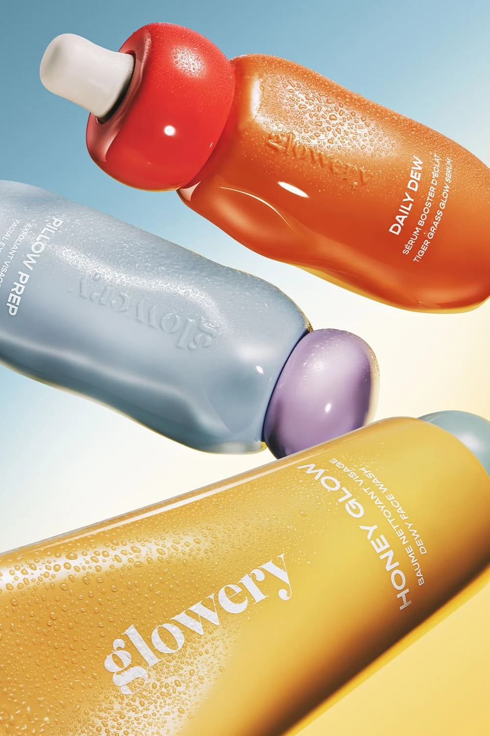
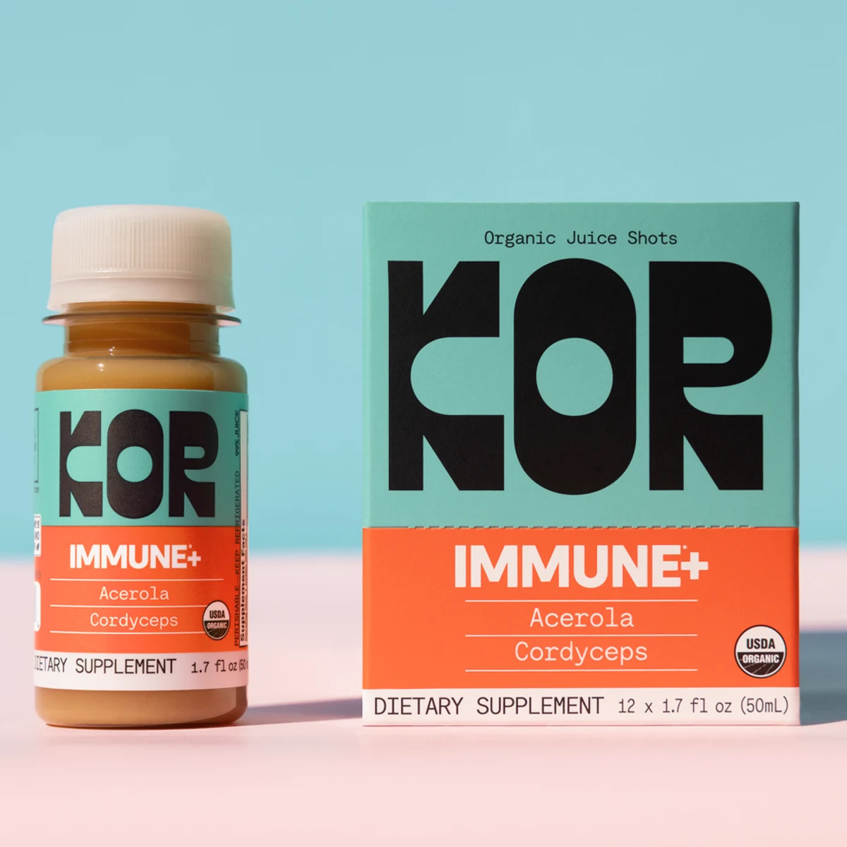
The other half is why I built it this way. Discover is a free library of real work (the Glowery shot and the KOR listing above both came out of it) and when you pick one, the analysis step writes down what the photographer decided: crop, angle, light, surface, colour logic. That analysis is what reaches the model, next to your locked product. A scene a human composed, on the product you actually sell.
08
Common questions
Why does AI change my product when I described it so carefully?
The care goes into the wrong channel. A description compresses your product and generation decompresses it using a different reference set than yours. My 250 word attempt still lost twelve things, and some of them, like the exact proportions of a bag, are not really writable. Attach the photograph instead.
Will a better prompt fix product accuracy?
Only up to a point, and the point is low. Prompts control scene, light and framing well, but they are a poor instrument for specifying an object that already exists. Reach for a reference image first, then spend prompt effort on the scene.
Why does the text on my packaging come out garbled?
Small text is where drift is most visible, because you can read it. Vendors document the limits directly, including underperformance on non-Latin alphabets and on text whose colour or style varies. Keep real type as a layer you composite on top rather than asking a model to render your legal copy.
Why is my product a slightly different colour in AI photos?
Two causes worth separating. The model may have a house tint it applies on every pass, which stacks if you run an image through twice. And it may substitute its own idea of a colour name for your shade, because "sage green" is a region rather than a value. Attach the reference, avoid re-editing an edited file, and check against the real thing before it reaches a listing.