
Abandoned Cart Email Examples: 6 Real Ones, Pulled Apart
The joke is not the lesson. The structure is.

Henry SedgwickProduct marketing
Search for abandoned cart email examples and you get the same four screenshots from about a decade ago, all teaching the same lesson: be funny. That is not the lesson. I went into the AIMS library and pulled six cart emails that brands are sending right now, and what they share is not a tone of voice. It is a decision about what the email is for.
The short version. A cart email that works shows the exact thing the person left behind, gives them one obvious way back to it, and removes the specific reason they stopped. The puns are decoration on top of those three jobs. The six below are worth studying because they answer the third one in six different ways.
70.22%
Average documented cart abandonment rate, across 50 studies (Baymard)
40%
Abandon because extra costs at checkout were too high
42%
US shoppers who abandoned because they were just browsing
01
What an abandoned cart email is actually for
Show the thing
The specific product, at the price they saw. Generic "your cart is waiting" copy makes the reader do the remembering.
Remove the reason
Shipping cost, returns risk, a question they could not answer. Pick the objection your checkout actually creates and answer it in the email.
One way back
A single primary button that lands on their cart, not the homepage. Every extra choice is a chance to close the tab.
Arrive while it matters
Klaviyo suggests a first message two to four hours after checkout starts. Its prebuilt flows default to four.
02
Six real abandoned cart email examples
These are screenshots of live emails, pulled from the AIMS library, not templates or mockups. I have credited every brand. Read them as six different answers to the same question: this person stopped, so what do we put in front of them?
Six cart emails, six different asks
The one that refuses to discount
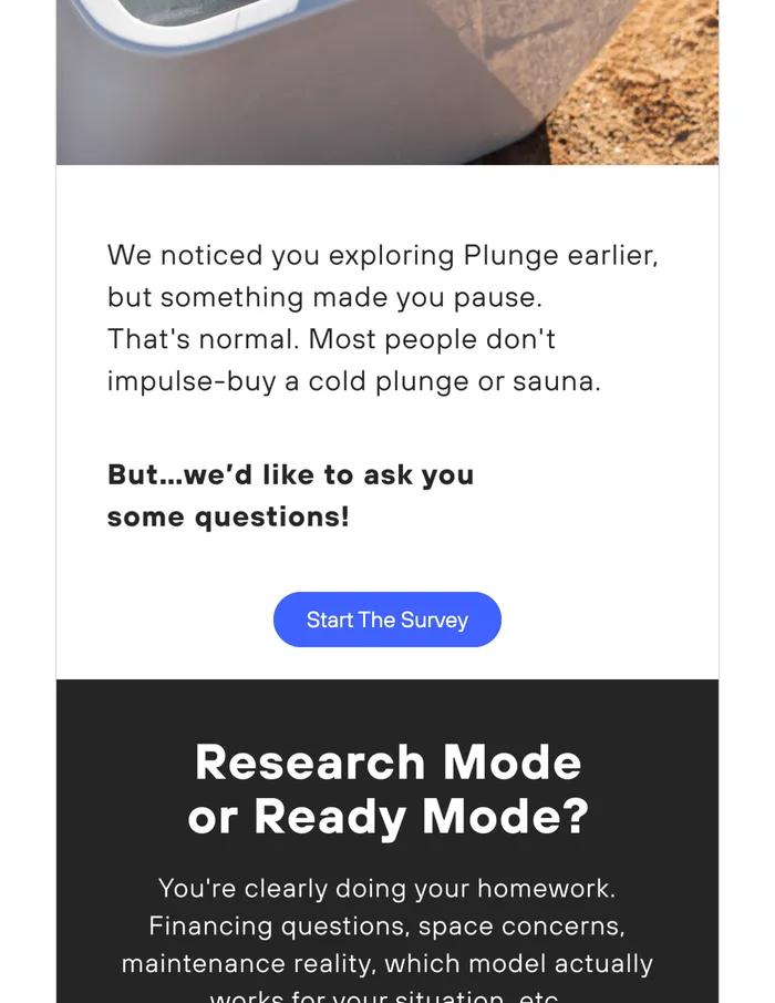
Plunge sells cold plunges and saunas, and the email never mentions money. It notes that you paused, tells you that is normal because nobody impulse buys a cold plunge, then asks you to take a survey. The section beneath is headed "Research Mode or Ready Mode?" and lists what you are probably worrying about: financing, space, maintenance, which model fits.
The one that is not about a cart
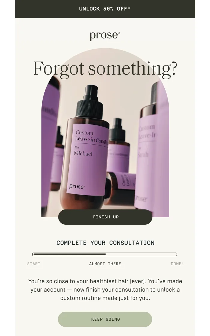
Prose sells custom hair care, so the thing you abandon is a consultation, not a basket. The email reframes the whole event: a progress bar marked start, almost there, done, sitting most of the way along, with buttons that say Finish Up and Keep Going. The product photograph shows bottles printed with a customer name. Nothing about it reads as a sales email. It reads as an unfinished task, which is much harder to ignore.
"We swapped our cart email headline from twenty percent off to a line about free returns and the discount code use dropped by half. Same number of orders. We were paying people to buy things they were already buying." Marguerite, footwear, four person team
03
What the six have in common
One primary button
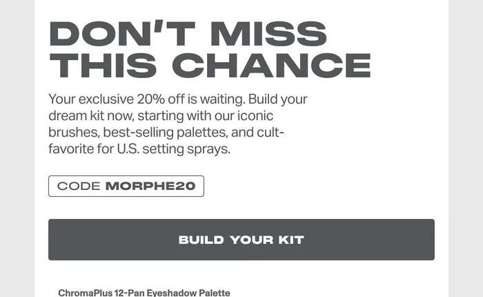
Every one of them has a single obvious action above the fold. Morphe adds a priced grid, but only after Build Your Kit.
The objection is named
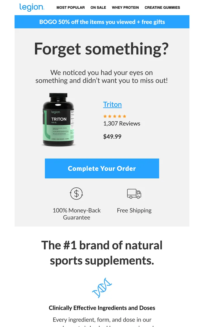
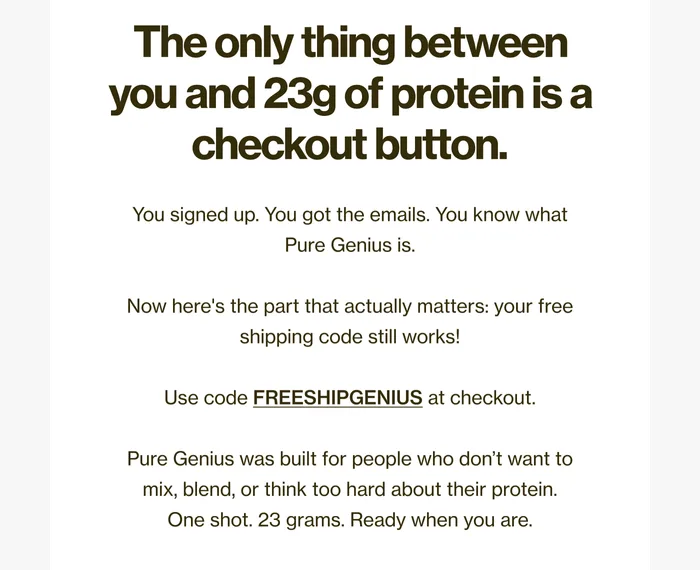
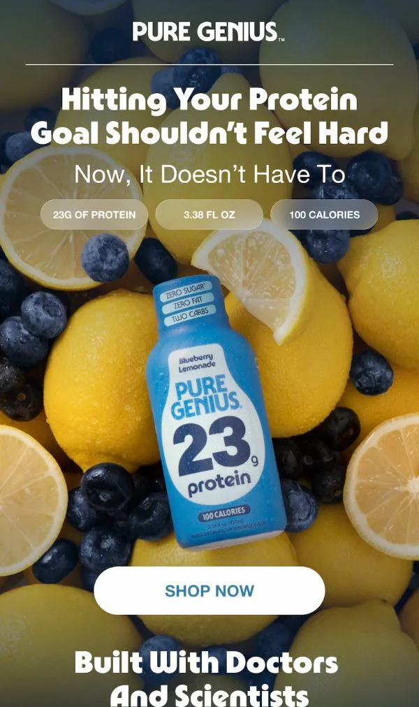
Legion puts money back guarantee and free shipping as icons directly under the button. Pure Genius spends its whole body copy on the shipping code.
The incentive escalates, it does not open
Legion holds its BOGO offer until after the product and the CTA. Nobody leads with the biggest number they have.
A second path for the undecided
Morphe closes with "Not sure where to start?" and Shaman offers a buyer guide. If the reader is not ready for the cart, there is somewhere else to go.
Nothing depends on images loading
Every headline and every button is live text. Turn images off in Gmail and all six still make sense.
Copy the job the email is doing, not the joke it is telling. The joke belongs to their brand. The structure works for anyone.
04
Timing: two emails, not one
- 1
Two to four hours: the reminder
Klaviyo recommends the first message two to four hours after a checkout starts, and its prebuilt flows default to four. No discount. Product, price, button, and the trust signals that answer your most common objection.
- 2
Twenty to forty eight hours: the nudge
Klaviyo puts the second email twenty to forty eight hours later. This is where an incentive earns its place, and free shipping usually beats a percentage because it removes the cost that caused the abandonment.
- 3
Longer, if the price is high
For considered purchases, stretch the delays and change the ask. Plunge sends a survey rather than a coupon because the buyer is still researching.
05
Why your abandoned cart flow is probably not firing
This is the part the example roundups leave out, and it matters more than the design. A cart flow can only send to somebody the platform can identify. In Klaviyo, the standard trigger is Started Checkout, and that event fires once the shopper has filled in their contact details and moved on to shipping. No email address means no event, which means no flow, no matter how good the template is.
Three gates between an abandoned cart and a sent email
06
How to build yours without a designer
Here is the honest position, and it is why I built AIMS the way I did. Ask an image model for a cart email and you get a picture of one: a flat JPEG, no live text, no working button. Ask a builder to write one from a prompt and you get real blocks in an order nobody tested.
The models are genuinely good at making things. What they lack is taste, and taste in an email is mostly sequence: product before proof, proof before offer, one button before four. That sequence exists in the six above because a person put it there. So do not describe what you want. Hand the model an email that already worked and let it carry the structure across.
- 1
Find a cart email worth starting from
AIMS Discover is a free, searchable archive of real brand emails with an Abandoned Cart filter. Pick one whose job matches yours, not one whose colours you like.
- 2
Let the teardown do the reading
The analysis step names what the designer actually did: the block order, where the offer sits, which objection the trust row answers. That written analysis is what gets handed to the model, not just a picture.
- 3
Rebuild it on your product
Your photography, your palette, your voice, on the proven skeleton. Live text and real blocks, so the button works and the headline survives images being switched off.
- 4
Ship it into your flow
Export it into the two email sequence above, then change one variable at a time. You now have a version worth testing against.
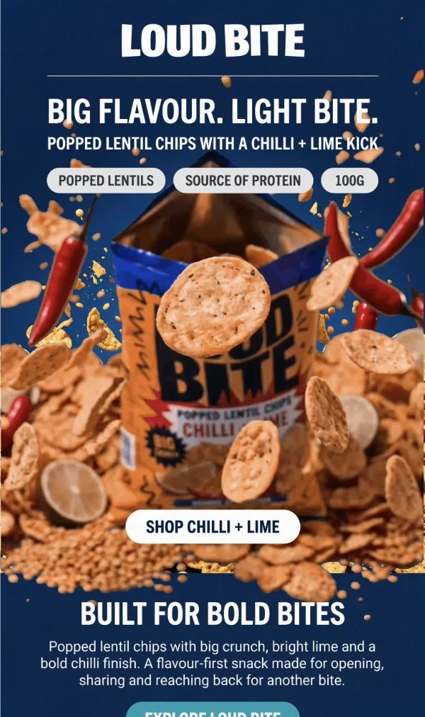
What the rebuild step actually looks like
"I had been sending one cart email with a fifteen percent code in it for two years. Splitting it into a plain reminder first and the code second was an afternoon of work and it is the only flow change I have made that I could see in the numbers." Tobias, pet supplements, doing about 90k a month
07
Common questions
How many abandoned cart emails should I send?
Two is the sensible floor and three is common. Klaviyo suggests a first message two to four hours after checkout starts and a second twenty to forty eight hours later. Add a third only if you have something new to say in it, such as a genuine deadline or a stock warning that is true.
Should the first email include a discount?
Usually not. If people convert on the first email without one, you have been paying for orders you already had. Hold the incentive for the second message, and try free shipping before a percentage, since extra costs are the most common fixable reason people abandon.
What is the difference between abandoned cart and browse abandonment?
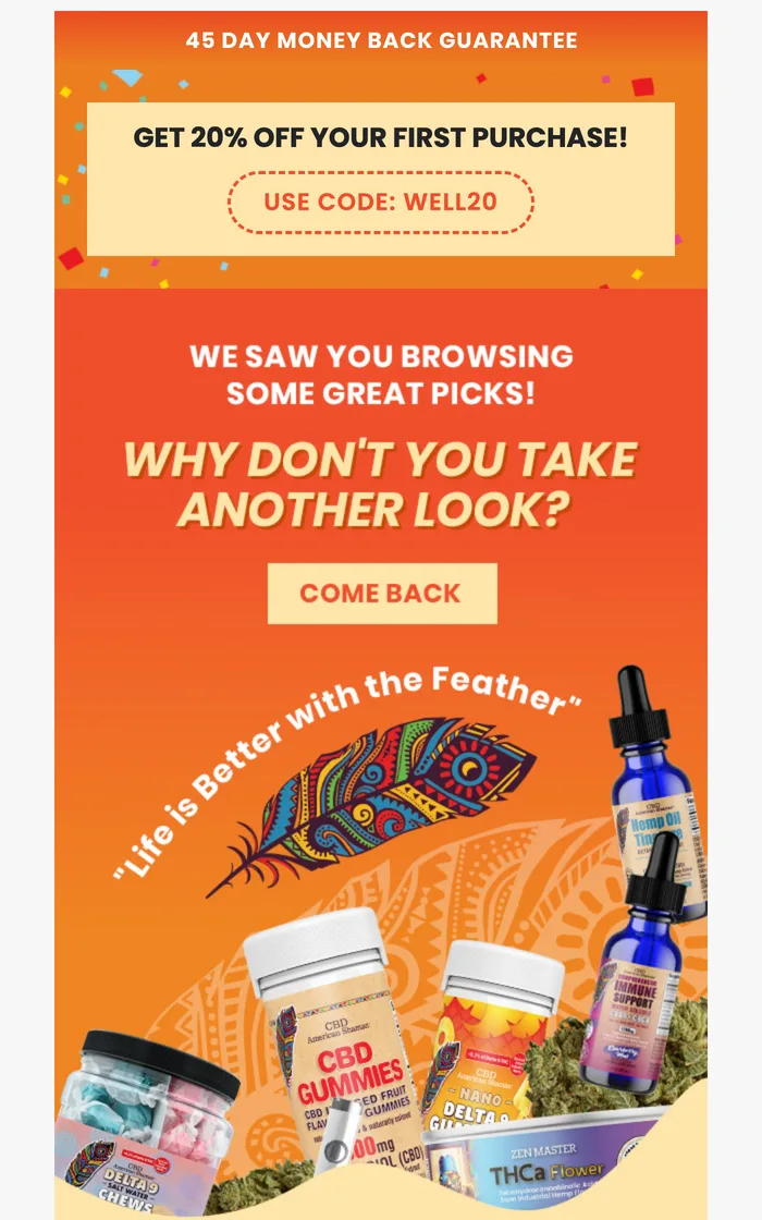
A cart email fires after someone adds an item or starts checking out, so you know the exact product. Browse abandonment fires after someone views a page and leaves, so intent is weaker. The CBD American Shaman example above is browse abandonment, which is why it offers a general first order code rather than the specific item.
Where can I see abandoned cart emails from real brands?
AIMS Discover is free and has an Abandoned Cart filter, which is where every screenshot here came from. Really Good Emails is another good gallery. A searchable archive beats a listicle because you can find brands in your own category rather than the same famous handful.